
10 Intriguing Maps of Palo Alto
September 15, 2021
We love maps. The graphical representation of complex data sets just sets our hearts a-flutter like few things do. You will see this kind of information about your home once in the “disclosures” that accompany a home purchase. The Young Platinum Group helps you understand disclosures and what they mean, and whether something apparently problematic might not be (Leaking Underground Storage Tanks probably sound worse than they are), or really might be a problem (gas line easement right under your house). Potential hazards like this can seem scary without context. We can help.
But wait— this is (was) 2021! Let’s gain our own context! Did you know that much of this is available online for you to peruse, snoop, and geek at your leisure? Let’s investigate some of the best graphical data describing Palo Alto properties!
1. Flood Maps
Significant parts of our fair city are projected to be drenched in a 100-year flood. If the San Francisquito Creek were to overflow its banks, downstream areas get wet as the water moves downhill to the Bay. City building codes require new construction to build high enough and with the sort of flood venting that will mitigate this, but older structures may have some risk. Where are you on this map?
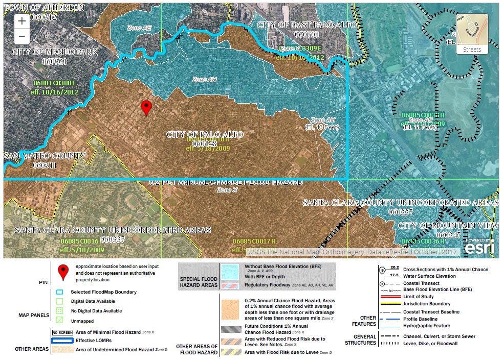
Interactive Version: https://msc.fema.gov/portal/home
2. Liquefaction Maps
Liquefaction is the term used to describe soil becoming liquid-like in an earthquake. Bedrock is literally rock-solid, while landfill has significant risk. A lot of Palo Alto (and indeed the entire Bay Area) has a low chance of liquefaction.

Interactive Version: https://pubs.usgs.gov/of/2008/1270/of2008-1270_San_Andreas_scenario.pdf
3. EPA Hazards Map
Palo Alto is a pretty clean city when it comes to the sort of chemical waste and environmental cleanup that the EPA tracks. Looking at the maps, you can see that East Palo Alto and Mountain View have significant incidence of brownfield sites (an area contaminated, or possibly contaminated with hazardous substances, pollutants), and Superfund sites (polluted locations requiring long-term cleanup efforts). But we have very few. Find out more from the EPA.

4. Natural Gas Pipeline Maps
We all want gas piped into our houses, but no one likes to be right on top of a major transportation artery. Where is the nearest major transport pipeline to where you live?

5. Earthquake Maps
How frequent are big quakes? Where is the San Andreas fault and the Hayward fault? The epicenter of a quake is not always where the most damage occurs, but its still interesting to view the data, such as this pull from 2018-09-02 – 2008-09-02 of earthquakes 2.5 magnitude or higher.

Interactive Version: https://earthquake.usgs.gov/earthquakes/map/
6. Aeronautical Charts
Flight paths, air exclusion zones, runways, transponders… we haven’t the foggiest idea what it all means (we’re realtors, not pilots!) but it sure looks fun.

Interactive Version: http://vfrmap.com/?type=vfrc&lat=37.461&lon=-122.115&zoom=10
7. Parcel Reports
Every wonder the lot size of your neighbor? How far an easement goes? Maximum floor space allowable in a lot? The City of Palo Alto has a parcel report website for you!

Interactive Version: http://199.33.32.49/ParcelReports/
8. Public Works Maps
Palo Alto’s department of Public Works has great maps available! Zoning, location of public trees, trails, when your road was last paved… tons of cool data for interested citizens is available here.

Interactive Version: https://data.cityofpaloalto.org/home
9. Historical Geography
Stanford has some great scanned historical maps. It’s fun to try to figure out where you are from connecting a historical place name to the modern one. If you wanted to cross El Camino Real in 1883 to enter Stanford, for example, you’d be walking across the “County Road San Jose to San Francisco”. And the Caltrain tracks were the “Southern Pacific Railroad”.

Interactive Version: https://purl.stanford.edu/ts132pf9359
Lots of Stanford Maps: https://www.davidrumsey.com/luna/servlet/view/all?sort=Pub_List_No_InitialSort%2CPub_Date%2CPub_List_No%2CSeries_No
10. More Historical Maps
The US Geological Survey has a neat site where you can pick your geo and time period, then see what historical maps exist. Like this gem below, showing how big Palo Alto was compared to little Mayfield (now the California Avenue downtown area of Palo Alto). And look at tiny Menlo Park… simply adorable. And is that commuter rail to St. Patrick’s Seminary, then known as “Catholic University”? Ah, we were so young then…

Interactive Version: https://ngmdb.usgs.gov/topoview/viewer/#14/37.4314/-122.1451
Summary
Maps are fascinating and beautiful on their own. But sometimes they contain very pertinent information related to whether you should buy a certain house or not. At the Young Platinum Group we can help you pull the signal from the noise and interpret all of this data. Except for the airplane part.